Harmful Algal Bloom 🦠 detection with Wyvern hyperspectral imagery

Let's embark on some exploratory data analysis using Wyvern's hyperspectral imagery Open Data Program. Harmful Algal Bloom (HAB) detection is attempted using selected band wavelengths and raster analysis techniques. This is part 1 of 2 of a series about modern GIS pipelines leveraging Python and the open-source, cloud-native geospatial tech stack...
2025-07 Thanks to Wyvern for the mention and compliments about this blog post!
Part 1 of 2
Data Engineering is a Software Engineering discipline, and one of the things data engineers do is help scientists get their code into production, make it reproducible, and make it fast.
- In this post, I put on my Data Scientist hat and try some exploratory data analysis (EDA) using: Python, RasterIO, NumPy, Shapely, GeoPandas, MatplotLib, Ipyleaflet, and Jupyter.
- In Part 2, I wear my Data Engineer hat and port the Python code from the notebook environment into Dagster, a production-grade data orchestrator.
Harmful Algal Bloom (HAB) in the news
The Guardian recently published this article with related facts, photos and interviews:
As the Earth heats up, the amount of algae in our waterways is rapidly increasing, transforming the colour of lakes and killing entire ecosystems. source: Patrick Greenfield, The Guardian, 2025-06-10
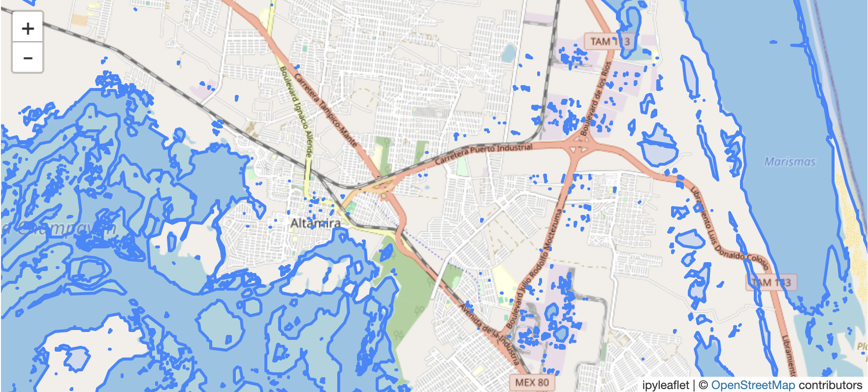
Summary and interactive map
First try out this interactive map: Zoom in, pan, and switch the raster layers on and off. Each layer was produced in the linked Python notebook, and introduced below.
The rest of this post explains how these three map layers were generated. A Python notebook with all the technical details and source code is linked at the bottom.
Apologies because the blog post title was slightly misleading. I am not detecting Harmful Algal Blooms (HAB), rather calculating Normalized Difference Chlorophyll Index (NDCI). Chlorophyll-a is widely used as a representative indicator for algae in water. It's the primary photosynthetic pigment found in almost all photosynthetic organisms, including algae.
There are related indexes which could be explored in the same manner, such as Blue-Green Algae Index (BGI), Floating Algae Index (FAI), and others. For further reading, Wyvern lists many indices and formulas in their Knowledge Center.
The normalized difference indices presented here use conventional GIS raster analysis based on this elegant and intuitive principle. Different materials on Earth's surface (water, vegetation, soil, etc.) reflect and absorb electromagnetic radiation differently across various wavelengths. By calculating the difference between reflectance values in two carefully selected spectral bands, then normalizing this difference, we can highlight specific features while minimizing other factors like atmospheric or illumination conditions.
The specific indices leveraged in this notebook are:
- Normalized Difference Water Index (NDWI): this index is leveraged to create a water mask, which is used later in the pipeline.
- Normalized Difference Chlorophyll Index (NDCI): is a simple alternative for detecting chlorophyll-a in water bodies.
The full Python notebook is linked below and can be previewed in NBviewer (recommended) or GitHub.
Wyvern's hyperspectral imagery (HSI)
Wyvern Space's hyperspectral imagery (HSI) has Visible and Near-Infrared (VNIR) sensors, with 5 meter spatial resolution, and between 23 and 32 hyperspectral bands. Leveraging it's narrow Full Width at Half Maximum (FWHM) allows the sensor to distinguish between many different wavelengths of light.
Open Data Program
It's excellent that Wyvern has embraced open standards by publishing with flexible licensing and a Spatio-Temporal Asset Catalog (STAC). To access Wyvern's Open Data Program, just browse to https://wyvern.space → Access Open Data.
Walkthrough of notebook
Find a scene in Wyvern's catalog
PySTAC client and various other tools and SDKs can be used to search for and download images and metadata from a STAC catalog. However, for this exploratory data analysis it was convenient to browse the web interface (STAC Browser) and select an interesting scene.
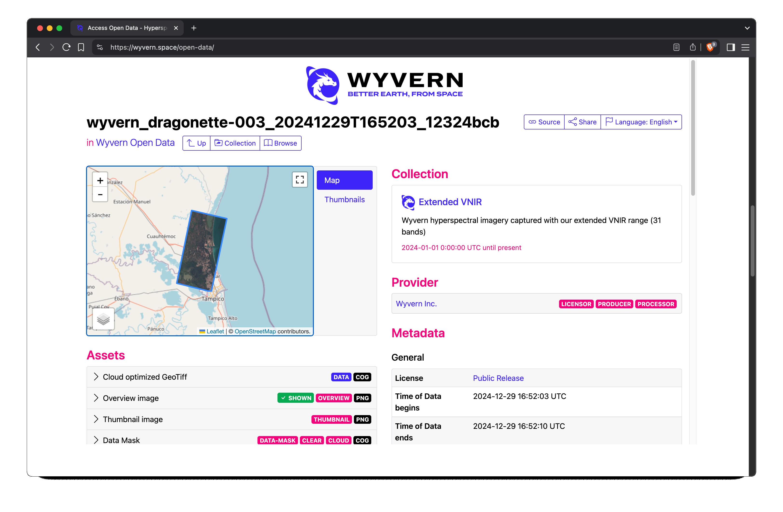 Here I selected a scene from December 2024 of near Tampico, MX. It's a humid-subtropical region with both ocean and
freshwater features, which seems like a good starting point for Harmful Algal Bloom (HAB) detection.
Here I selected a scene from December 2024 of near Tampico, MX. It's a humid-subtropical region with both ocean and
freshwater features, which seems like a good starting point for Harmful Algal Bloom (HAB) detection.
Visualize Scene Preview PNG from Wyvern
Wyvern provides an overview image of the satellite scene in PNG format, which they rendered from the peak Red, Green, and Blue bands selected from the 32 bands in the source image. Some observations:
- There is no visible cloud coverage or fog. It is interesting to compare with the provided QA cloud/clear mask rasters below.
- Preview PNG image is not geo-referenced because PNG format does not (at least not directly) support that.
- Preview PNG image does not appear particularly vibrant.
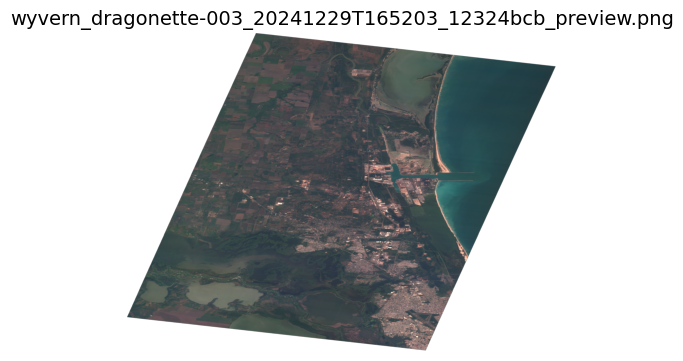
(Wyvern's provided preview PNG. Download full-sized image ~13MB)
The source scene image is in Cloud Optimized Geotiff (COG) format and for the reasons listed above, I decided to create a new preview image in Geotiff format in this pipeline.
⚠️ Architectural decision: surface level reflectance processing
I will not apply surface level reflectance processing in this pipeline. There are many options but they all require fine tuning and effort. Some examples are: ATCOR, 6S, iCOR, ACOLITE, SPy, HypPy, and ENVI. It is acknowledged this is a shortcut, and for correctness or production usage, this pipeline should use Level 2A:
Level 2A: Image data which has been atmospherically compensated/corrected to bottom-of-atmosphere (BOA) surface reflectance and orthorectified with digital elevation model (DEM) terrain correction. Wyvern Knowledge Center
Visualize QA rasters for cloud/clear mask
Wyvern provides cloud and clear mask rasters. There appears to be something wrong in this scene's cloud mask because there is no detectable cloud coverage or fog or haze in the visual preview rasters, but there are clouds (1 value) on the cloud mask raster.
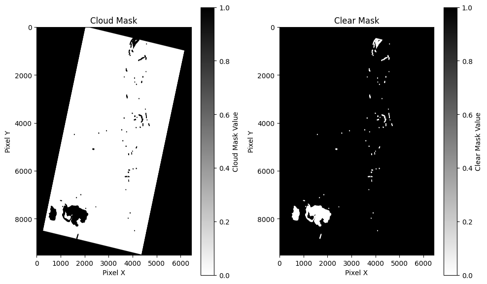
(in-notebook raster visualization)
⚠️ Architectural decision: no cloud mask
I will not use the clear/cloud mask layers for this pipeline. They don't seem accurate, or I cannot interpret the masks. When closely inspecting the preview image above, it basically appears to be a cloud free scene.
New preview image in Geotiff format
Moving right along. The Python notebook has all the details, but here is the next visual:
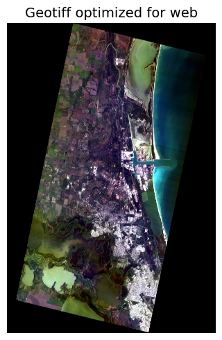
(in-notebook visualization of the new preview image Geotiff, RGB, web-ready).
This Geotiff meets the key requirements:
- Geo-referenced
- Vibrant in appearance
Also note this preview image is the satellite base-map which is loaded into the interactive map viewer above.
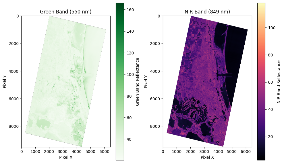
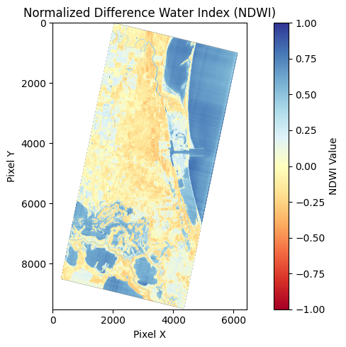
Normalized Difference Water Index (NDWI)
Formula
Where:
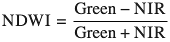
- Green = Band 9 (550 nm)
- NIR = Band 30 (849 nm)
Range and interpretation
The range is [-1, 1] and interpretation is 1 = water and -1 = no water. Values closer to 1 indicate high probability of water, while values closer to -1 indicate non-water features like vegetation or dry soil. In typical applications:
- Values > 0.3: Usually indicate water bodies
- Values between 0 and 0.3: May indicate wet soil or mixed pixels
- Values < 0: Usually indicate vegetation or dry soil
Make water mask raster from NDWI
These images are copied from the notebook to visualize the pipeline for producing a water mask from NDWI.
(in-notebook visualizations of rasters)
(screen capture of in-notebook polygonized water mask in GeoJSON vector format)
There could be some quality issues with the generated water mask. Although it generally looks good, it is also detecting water on top of some buildings, so the threshold might need to be greater than 0.3 for less sensitivity.
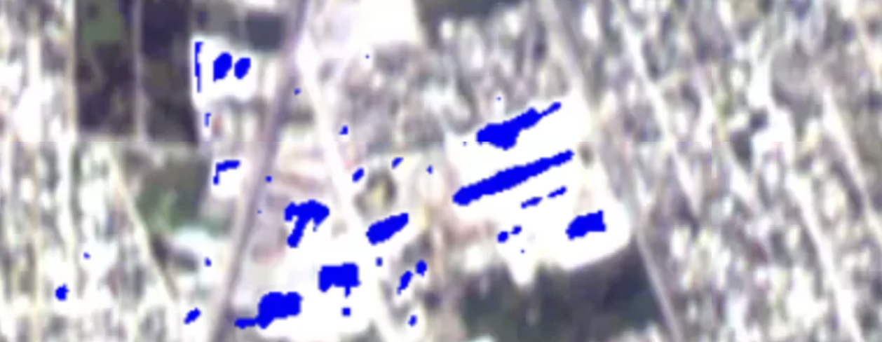
(example of possible water on building roofs? pooled rainwater?)
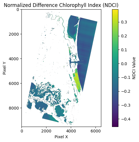
Normalized Difference Chlorophyll Index (NDCI)
Formula
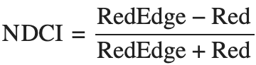
Where
- RedEdge = Band 21 (712 nm)
- Red = Band 17 (669 nm)
Range and interpretation
The range is [-1, 1] and the interpretation is:
- Higher positive values indicate higher chlorophyll-a concentration
- Values near zero suggest low chlorophyll-a levels
- Typical range is approximately -0.1 to +0.3 for most inland waters
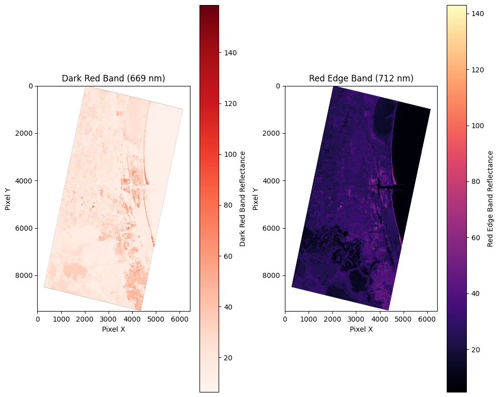
Make NDCI rasters
These images are copied from the notebook to visualize the pipeline for calculating NDCI and creating the NDCI rasters.
- Higher positive values indicate higher chlorophyll-a concentration
- Values near zero suggest low chlorophyll-a levels
- Typical range is approximately -0.1 to +0.3 for most inland waters
Also note this NDCI raster is a layer which is loaded into the interactive map viewer above.
Concept of a production pipeline
The linked Python notebook demonstrates a proof-of-concept, and it makes the following data products:
visual preview rasters
- wyvern_dragonette-003_20241229T165203_12324bcb-L1B-viz.geotiff
- wyvern_dragonette-003_20241229T165203_12324bcb-L1B-viz-epsg-3857.geotiff
NDWI-based water mask: analysis-ready, web-ready raster and vector
- wyvern_dragonette-003_20241229T165203_12324bcb-water-mask.geotiff
- wyvern_dragonette-003_20241229T165203_12324bcb-water-mask-viz.geotiff
- wyvern_dragonette-003_20241229T165203_12324bcb-water-mask-viz-epsg-3857.geotiff
- wyvern_dragonette-003_20241229T165203_12324bcb-water-mask.geojson
NDCI: analysis-ready and web-ready raster
- wyvern_dragonette-003_20241229T165203_12324bcb-NDCI.geotiff
- wyvern_dragonette-003_20241229T165203_12324bcb-NDCI-viz.geotiff
- wyvern_dragonette-003_20241229T165203_12324bcb-NDCI-viz-web-epsg-3857.geotiff
What would this notebook look like in terms of a production pipeline? Here is a first diagram of a pipeline, which it is also useful to know, is a Directed Acyclic Graph (DAG). In Part 2, I wear my Data Engineer hat and port the Python code from the notebook environment into Dagster, a production-grade data orchestrator.
Links to notebook at NBviewer and GitHub
This walkthrough blog post was just a high level view. The notebook has a lot more explanatory text and Python source code.
©2024 Wyvern Incorporated. All Rights Reserved.
🌎 Thanks for rambling! 👋🏼
- 2025-06-04 Remove Claude 3.7 quote and attribution and just inline the content (seems like best practice these days).
- 2025-06-09 Correct the number of bands in Dragonette constellation: 23-32.
- 2025-06-10 Add Guardian article about HABs.
- 2025-07-26 Add link to Wyvern's write up and feature.
- 2025-08-10 Add link to Part 2!